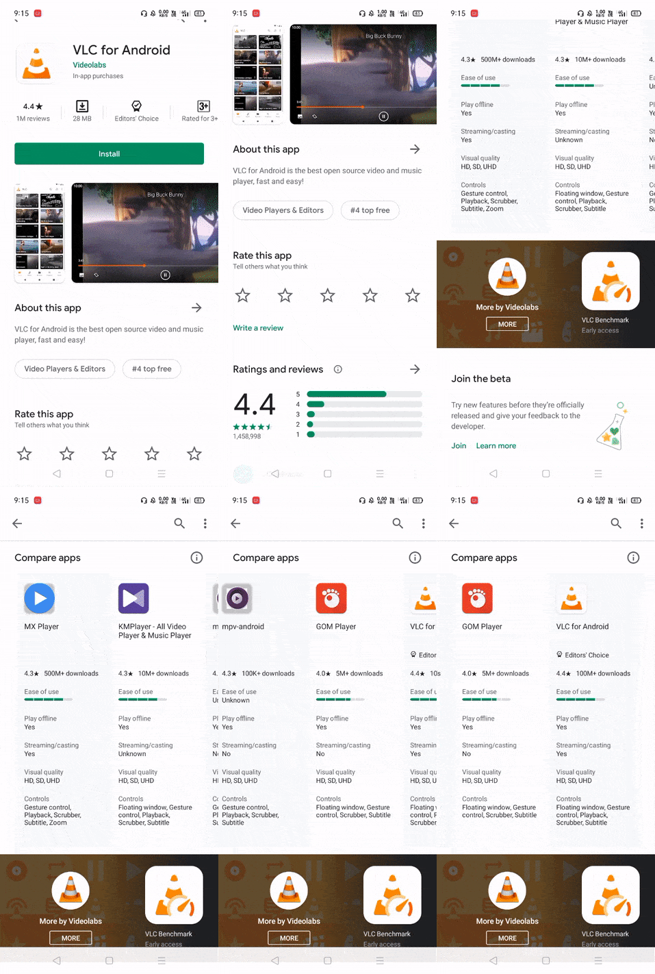
As one of the most important apps on a smartphone, Google is always making tweaks to the Play Store to improve its usability and design. Earlier this month, a controversial test was spotted that took hamburgers off the menu. Now the Play Store is experimenting with a new change that shows direct comparisons between similar apps to let users decide which best fits their needs.
The “Compare apps” section shows up on individual app listings near the bottom of the page, though it seems to be limited to a few popular media players at the moment. When it does appear, it displays popular apps that are similar to the current listing, comparing them based on things like ease of use and whether or not they support features like offline playback and casting.

Google often asks simple questions to people who leave app reviews, and it’s likely the data displayed is based on this kind of user feedback. With so many apps in the Play Store, it can be hard for the best ones to rise to the top. Comparing some of the choices side by side so users can see their options seems like a smart addition.
Like many other tests Google runs, there’s no telling when or if this will roll out more widely. It’s been spotted in the wild on version 22.4.28 of the Play Store, but there’s likely a server-side component that determines whether the new app comparison section shows up or not. Hopefully it hits the mainstream sooner rather than later — compared to the current Play Store app listing page, I definitely like this one better.

