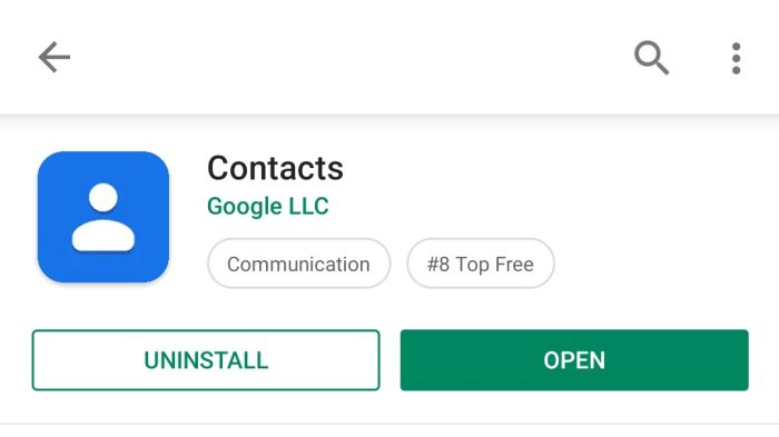
Back in March, Google introduced a new rounded square icon requirement for the Google Play Store on Android and Chrome OS. App developers can choose to enable the new icon specification immediately, with the Google Contacts listing already featuring the updated style.
The goal is to “bring consistency and a cleaner look to Google Play” on different UI layouts, form factors, and devices. It prohibits transparent backgrounds, with Google dynamically adding rounded corners and drop shadows to icons. This applies to the Play Store on Android phones and tablets, as well as Chromebooks.
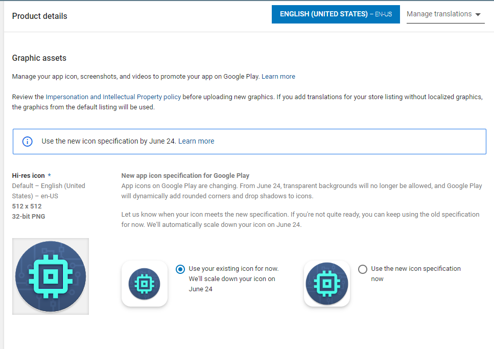
Within the Google Play Console, the Graphic Assets section of Product Details notes how the mandatory change will come into effect on June 24th. Per the previously announced timeline, developers can begin uploading the updated icon style today.
Let us know when your icon meets the new specification. If you’re not quite ready, you can keep using the old specification for now. We’ll automatically scale down your icon on June 24.

In fact, developers that are ready “Can use the new icon specification now.” Google Contacts is one example of an updated listing on the Play Store. Of course, developers can continue to leverage their existing art until the deadline.
By May 1st, old icons that don’t meet the standard cannot be uploaded and won’t be accepted. By late June, new icons must be added, or Google will automatically convert original icons to a “legacy mode.” This places an existing icon of any shape into a white rounded square.
This change does not apply to Google Play for Android Auto, Android TV, and Wear OS, or any APK launcher icons on any platform.

Google has released guidance and resources for Android developers updating their app icons to the new attributes, sizing, shadows, corner radius, and badges.
