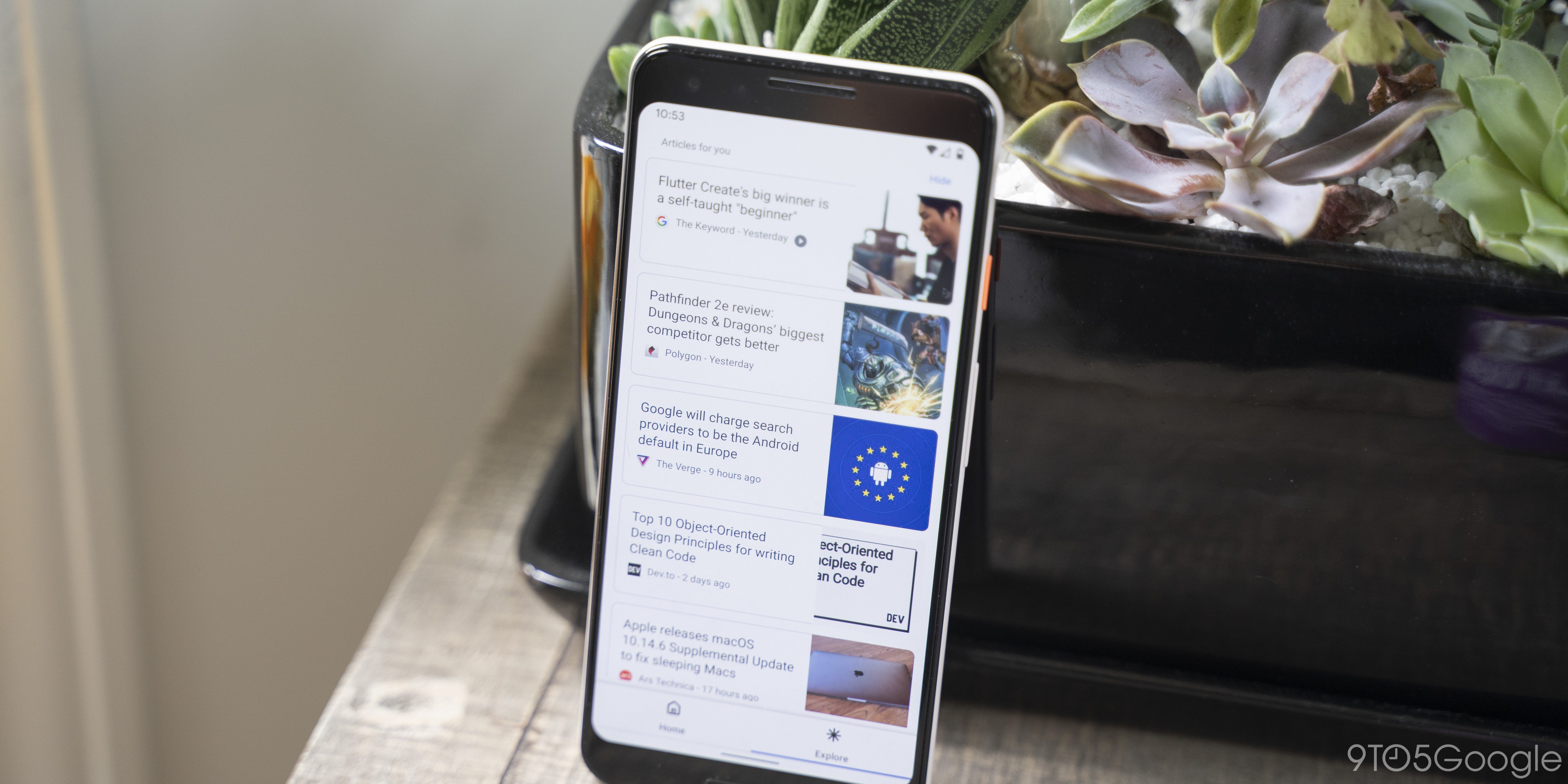
Over the past two years, Google has been trying a number of UI redesigns on Chrome for Android, some of which have worked decently, others have drawn complaints. The latest Chrome for Android redesign, called “Start Surface,” replaces the somewhat complicated “Duet” layout and adds a dedicated “Explore” tab.
Google’s last redesign of Chrome for Android, Duet (previously Duplex), boldly attempted to move much of the browser’s UI from the top of the screen to the bottom. However, opinions of Duet have been heavily split, even among 9to5Google staff. Being known to develop features in an A/B format, Google has begun work on a solid alternative layout to Duet, called Start Surface.
This new layout is already available for testing in both Chrome Dev and Chrome Canary for Android, behind a new flag in chrome://flags. Beyond just enabling the Start Surface flag, you will also need to make sure that the Chrome Duet flag (#enable-chrome-duet) is disabled.
Two Panes Start Surface
Enable showing two panes start surface when launching Chrome via the launcher.
#enable-two-panes-start-launcher
Once you’ve got your flags flipped and your browser restarted, you may not immediately notice any changes. Tap open the tab switcher, however, and you’ll see a brand new layout for Chrome for Android, featuring “Home” and “Explore” tabs along the bottom of the screen.


Switching over to the Explore tab on Chrome Canary currently shows a fullscreen version of the same “Articles for you” normally found on Chrome for Android’s New Tab page. As of now, the Explore tab is non-functional in Chrome Dev.
Google calls this the “two panes” version of Start Surface, as it shows the two tabs, Home and Explore, at the bottom, but the Chrome for Android team is also about to be testing a “single pane” version in the near future. We’re not yet sure how this will look, but it looks like it will have much in common with the current New Tab Page, as there are mentions of “most visited” tiles and the Google search box.

