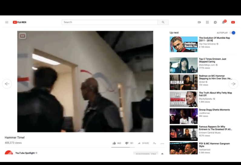
The YouTube desktop site was designed for 16:9 video, with videos in any other aspect ratio—most commonly 4:3 for old TV material or 9:16 for vertical smartphone video—padded with black bars until they fit the 16:9 box. In a change that Google is currently rolling out, those black bars are now being scrapped, and the video box will instead take on the aspect ratio of the content it’s showing.
For 4:3 content, this means a bigger picture. It will be both wider and taller, pushing the title, description, and comments further down the page. For vertical video, the benefits are less apparent—empty space will open up on each side of the video—but even there, removal of the black bars means that narrow browser windows are less likely to cause the video to be sized down. Even 16:9 video is getting a little larger due to reduced margins and white space.
One might expect a change that makes videos a bit bigger to be embraced by YouTube users, but the YouTube Help Forum thread that describes the new design and rationale behind it is filled with unhappy YouTube users who want a return to the more consistent layout and positioning that the old design offered.
In a change that should be more popular, Google is also rolling out a dark theme for the Android YouTube app. The update is still being pushed out—my phone doesn’t present the option yet—but you can see some pictures of the feature at 9to5Google. With this update, the Android app is catching up with the iOS app and the YouTube website, both of which have had a dark option for some time. For late-night viewing, the darker look is certainly an improvement.

