
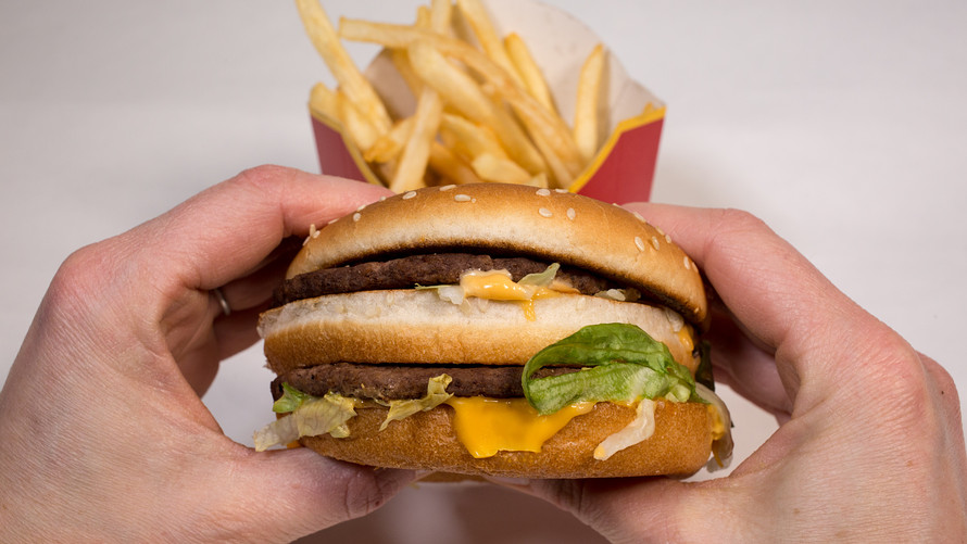

Can certain interior design features make you hungry for a hamburger? Some would say yes, and McDonald’s offers a master class in how to do it. Your craving for a quick Big Mac may send you to the door of a McDonald’s MCD, -1.31% but once you’re inside the restaurant, a carefully orchestrated set of sensory cues work together to maximize your spending and minimize your discomfort.
It may sound creepy or manipulative to people who aren’t familiar with how businesses use behavioral psychology, but one U.K.-based product consultant says McDonald’s is a stellar model for people like him, who make their living helping businesses use psychology to build better products and services.
Consultant Luke Battye studied the fast food chain’s new “experience of the future” restaurants and explained how their design sways customers in recent advice published on BehavioralEconomics.com.
The new design seems to be working for McDonald’s. Stock market analysts named the burger giant a top pick in early 2018, and despite recent price drops, it’s still considered a good buy. The chain recently made other changes to meet customers’ changing attitudes toward food: it’s using more fresh meat and putting less sugar in kids’ meals.
Here are some of Battye’s key insights on how the restaurant’s design affects customer behavior:
They ‘anchor’ our decisions
The first thing customers see when they walk in the door is delicious-looking photos of the chain’s newer menu offerings — called “Signature Collection” in the U.K. and “Signature Crafted Recipes” in the U.S. — the pricier, and by some accounts fattier, gourmet burgers. In positioning the photos near the entrance, McDonald’s is following research that shows that consumers tend to go with the first options presented to them when they’re making a decision.
They reduce psychological pain
But those attractive pictures and other promotional photos throughout the restaurant are missing some key information: The prices. This is a way of reducing the inherent psychological pain that comes from spending money.
They exploit humans’ ability to spot potential danger
Our eyes naturally track motion — the better to spot predators with. On digital menu displays in the restaurants, McDonald’s uses subtle animation to direct customers’ attention away from the lower-priced value meal options and point them toward the pricier ones.
This also helps McDonald’s address one of their ongoing challenges: Status quo bias, or humans’ natural tendency to stick with what they know. The chain is in a constant struggle to get customers to break away from their usual order and try something new, Battye noted.
They use good ‘choice architecture’
“Choice architecture” refers to the design of environments where people make choices. At McDonald’s, that’s the menu board. Only about 10% to 15% of the menu display is devoted to the traditional items like Big Macs and McNuggets, Battye found, while about 30% of the space is given over to the newer and pricier “Signature” items. This is a simple but effective way to get customers to give more consideration to those items.
They help us feel less guilty with a ‘health halo’
Our relationship with fast food is complicated. It’s pleasurable because it tastes good, but at the same time, our brains know it’s not the best nutritional choice. That creates the psychological discomfort known as cognitive dissonance. “This is where our beliefs (this is bad for me) are in contrast with our behaviour (I’m still going to buy it),” Battye wrote.
To help us feel better about that, McDonald’s deploys the “health halo.” They show a photo of a salad or bottled water on the menu display, which, studies show, makes customers perceive the entire menu to be healthier. This in turn makes us feel less guilty about overlooking those apple slices for French fries.
The “health halo” has another odd side effect: It can make us indulge more. One study by Cornell University’s Food & Brand Lab showed that when consumers believe the main dish on a menu is healthier, they end up choosing higher calorie drinks, desserts and side dishes.
McDonald’s isn’t alone
Of course, McDonald’s — which did not respond to requests for comment on these strategies — isn’t the only restaurant that uses these techniques. Food retailers try everything from menu fonts to the color of the walls to influence how much a customer eats, how their food tastes, and how long they stay.
Most nutritionists would probably raise an eyebrow at the goal of getting people to buy more fast food. Some of McDonald’s menu items reportedly have more sugar and salt now than they did 30 years ago, despite concerns about the health effects of sweets and sodium.
But Battye sees it differently. “I don’t think there’s anything wrong with a brand trying to use human insights to make their products more successful from both a customer’s perspective and a business perspective,” Battye told MarketWatch. “It’s ubiquitous. When a designer creates something that’s beautiful, that’s leveraging our psychological preference for symmetry.”