
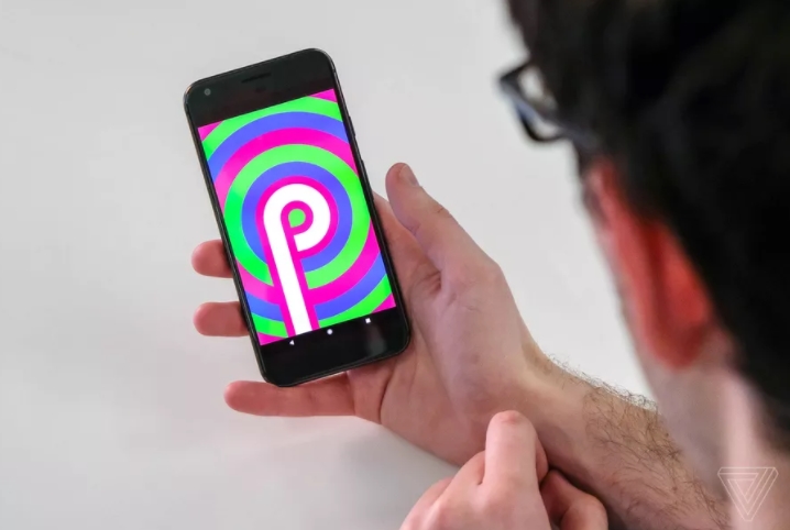

With the first developer preview of Android P out today, we’re getting our first look at the visual refresh that Google was rumored to be working on a few months ago. This is an extremely early build of the software, so it’s very likely that more changes are on the way — and some of what’s here might look different come the next preview. But even this barebones developer preview 1 makes clear that Google is taking things in a rounder, more colorful direction.
The next developer preview of Android P is expected sometime in May, so that’s the next opportunity we’ll have to see additional changes to Android as it appears on Google’s Pixel devices and other products. Here’s what’s new in today’s initial release:
THE CLOCK MOVES TO THE LEFT FOR NOTCH-FRIENDLY NOTIFICATIONS
/cdn.vox-cdn.com/uploads/chorus_asset/file/10378519/Image_uploaded_from_iOS.jpg)
The clock has moved from the far right to the far left side of Android P’s top status bar. And since the new OS is optimized for notches that might cut into the top display area, it starts putting notifications right next to the time. Up to four different app icons will appear; after that, Android P displays a simple dot to let you know there are more waiting once you slide down the notification tray.
A MORE COLORFUL SETTINGS MENU
/cdn.vox-cdn.com/uploads/chorus_asset/file/10378321/Screenshot_20180307_131633.png)
Google seems obsessed with constantly changing and reworking the Settings screen with every major Android update. This year, it’s making things a bit more colorful with new icons to the right of sections like Network, Display, Battery, etc. The actual layout of things has barely changed, but the grayscale icons from Oreo are gone and replaced by colorful circles. Very Samsung.
A MORE STRAIGHTFORWARD QUICK SETTINGS PULLDOWN
/cdn.vox-cdn.com/uploads/chorus_asset/file/10378561/Screenshot_20180307_132245.png)
This is one of the areas where it’s very obvious that Google is making changes. Corners have been rounded off, and the settings icons for Wi-Fi, Bluetooth, etc. are now inside circles that take on a colored accent when enabled or go gray when switched off. That horizontal bar beneath the icons is also near. Fully expanded, the new Quick Settings pulldown looks like this:
/cdn.vox-cdn.com/uploads/chorus_asset/file/10378575/Screenshot_20180307_132833.png)
THE DOCK LOOKS LIKE A DOCK AGAIN
/cdn.vox-cdn.com/uploads/chorus_asset/file/10378367/Screenshot_20180307_134005.png)
Android P’s dock, which contains your the favorite apps and a Google search bar, has been given a cloudy background to help it stand out from everything else on your home screen. That should also make it a bit more obvious as a thing to swipe up to reach the app switcher. There’s also a microphone icon to the right inside the search bar for even faster one-tap access to voice search and Google Assistant.
THE POWER MENU NOW LETS YOU TAKE A SCREENSHOT
/cdn.vox-cdn.com/uploads/chorus_asset/file/10379795/Screenshot_20180307_162157.png)
The Power Off / Restart pop-up on the Pixel now has an added feature beneath those two: screenshot. So if the normal button combo isn’t ideal in a given situation, you can just hold down power, tap the screenshot button, and it’ll capture what’s on screen — yes, without the power / restart / screenshot thing .
THE VOLUME SLIDER SHRINKS AND MOVES TO THE RIGHT SIDE
/cdn.vox-cdn.com/uploads/chorus_asset/file/10379817/Screenshot_20180307_162614.png)
Google must’ve liked relocating the power options in Android Oreo; now it’s doing the same thing with the software volume slider. The software engineers might need to do a little work to make this change more straightforward, though; even I got a little confused about the meaning of that arrows icon. (Tapping the Calls / Ring button switches between ring, vibrate, and silent ringer.)
THE PIXEL’S PRODUCT SANS FONT IS SHOWING UP IN MORE PLACES
/cdn.vox-cdn.com/uploads/chorus_asset/file/10378813/Screenshot_20180307_133721.png)
It’s unclear whether this is intentional or simply the result of this being a very early build of Android P, but the font that Google uses for the Pixel’s branding is shown in more places throughout the system, such as “Allow” and “Deny” here. It’s officially called Product Sans.